19 Color Schemes for the Home
Let’s talk color for a minute. Not the intimidating, paint-chip-overload kind—but the fun kind.
The kind where you imagine walking into a room and instantly feeling calmer, happier, cozier, or even a little more energized.
Choosing a color scheme for your home isn’t just about trends; it’s about mood, personality, and how you want your space to feel when you kick off your shoes at the end of the day.
So grab a cup of coffee (or tea—we don’t judge), and let’s walk through 19 color schemes for the home that actually work in real life.
Think of this as one home-lover chatting with another, sharing ideas, tips, and a few “learned-the-hard-way” insights along the way.
1. Warm White and Soft Beige
If your dream home feels calm, airy, and timeless, this one’s for you. Warm white walls paired with soft beige accents create a cozy glow without feeling boring.
It’s perfect if you love natural light and want your furniture and textures—wood, linen, wool—to do the talking.
Why it works: It never goes out of style and makes small spaces feel bigger.
2. Gray and Crisp White
This is the modern classic. A light gray base with clean white trim feels polished and fresh without being cold. Think modern apartments, Scandinavian vibes, and that “Pinterest-perfect but still livable” look.
Pro tip: Choose a warm gray to avoid that gloomy, rainy-day feel.
3. Navy Blue and Cream
Navy brings depth and drama, while cream keeps things warm and inviting. This combo is especially stunning in living rooms and bedrooms where you want a cozy-but-sophisticated vibe.
Feels like: A quiet evening with a good book and soft lighting.
4. Sage Green and Soft White
Sage green has become a favorite for a reason—it’s calming, natural, and incredibly versatile. Paired with soft white, it brings an earthy, spa-like feeling into your home.
Best rooms: Bedrooms, kitchens, and bathrooms.
5. Beige and Black
If minimalism had a warm personality, this would be it. Beige softens the sharpness of black, creating a balanced, modern look that still feels welcoming.
Style match: Modern, Japandi, or contemporary homes.
6. Terracotta and Cream
This color scheme feels like sunshine and clay pots and slow mornings. Terracotta adds warmth and personality, while cream keeps it from feeling too heavy.
Perfect for: Living rooms, dining areas, or Mediterranean-inspired homes.
7. Charcoal Gray and Warm Wood
This combo is sleek, moody, and grounded. Charcoal walls or accents paired with natural wood tones create depth and warmth at the same time.
Works well in: Offices, modern living rooms, and masculine-leaning spaces.
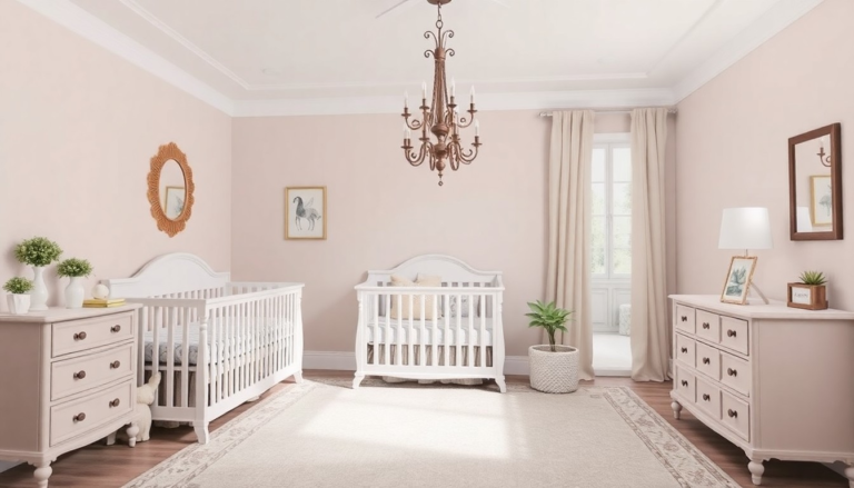
8. Blush Pink and Gray
Blush pink isn’t just for nurseries—it’s surprisingly grown-up when paired with gray. The result is soft, elegant, and just a little romantic.
Great for: Bedrooms, dressing rooms, or cozy corners.
9. Blue and White
This one’s a classic for a reason. Whether you lean coastal or traditional, blue and white always feel fresh and clean.
Style ideas: Navy for drama, powder blue for a relaxed, beachy feel.
10. Olive Green and Cream
Olive green brings richness and depth without overpowering a space. Paired with cream, it feels grounded, warm, and a little bit luxurious.
Bonus: Looks amazing with brass or gold accents.
11. Taupe and Soft Gray
If beige and gray had a stylish baby, it would be taupe. This scheme is subtle, sophisticated, and incredibly easy to live with.
Why people love it: It works with almost any furniture style.
12. Black and White
Bold, graphic, and timeless. Black and white is a high-contrast color scheme that feels modern and confident.
Design tip: Add texture—rugs, wood, plants—to keep it from feeling stark.
13. Dusty Blue and Warm Beige
This combo feels gentle and lived-in. Dusty blue adds color without shouting, while warm beige keeps everything grounded.
Perfect for: Family homes where comfort comes first.
14. Mustard Yellow and Gray
A little bold, a lot of personality. Mustard yellow brings energy and warmth, while gray keeps it balanced and modern.
Try it in: Living rooms or kitchens where you want a cheerful boost.
15. Forest Green and Off-White
Deep, rich, and cozy—forest green paired with off-white feels like a walk through the woods, minus the bugs.
Looks stunning with: Natural wood, leather, and layered textiles.
16. Greige and White
Ah yes, greige—the internet’s favorite neutral. This blend of gray and beige offers the best of both worlds.
Why it works: It adapts beautifully to different lighting conditions.
17. Soft Lavender and Gray
Lavender doesn’t have to feel childish. When softened and paired with gray, it becomes calm, elegant, and surprisingly modern.
Best rooms: Bedrooms or relaxation spaces.
18. Earth Tones (Brown, Clay, Sand)
This is for the nature lovers. Think warm browns, sandy beiges, and clay-inspired hues layered together.
Feels like: A cozy, grounded retreat from the outside world.
19. Monochromatic Neutrals
Using different shades of the same color—like layered creams or varying grays—creates depth without visual clutter.
Interior designer secret: Texture is key here.
How to Choose the Right Color Scheme for Your Home
Here’s the honest truth: the “best” color scheme is the one that feels right to you. Trends are fun, but your home should support your lifestyle. Ask yourself:
- Do I want this space to feel calm or energizing?
- How much natural light do I have?
- Am I decorating for now or for the long term?
Also, test your colors. Paint samples on the wall. Live with them for a few days. Morning light and evening light can completely change how a color feels.
Final Thoughts
Choosing from these 19 color schemes for the home doesn’t have to be overwhelming. Think of it as setting the emotional tone for your space. Whether you lean neutral, bold, earthy, or soft, the right color combination can completely transform how your home feels—without changing a single piece of furniture.
And remember: there are no rules set in stone. If you love it, it works. Trust your gut, have fun with the process, and don’t be afraid to make your home feel like you.